Tuesday 13 December 2011

Diary Entry #10 – creating my contents page

Diary Entry #10
I have now created my contents page draft on Photoshop. I found this a difficult page to create, as I had to focus especially on the page numbers of my magazine and make sure none were repeated or mentioned wrongly. I then had to find pictures I could use for some of the pages. On this page I have a title of ‘THIS WEEK...’ to make it obvious what this page will be discussing. I have five main sections on my contents page: features, news, plus, exclusives, reviews. This makes my magazine look busy and full of different types of stories, making my target audience feel they are getting value for their money.
I have also included a ‘Facebook’ section, which states that my magazine is now on Facebook. I feel this will make my magazine seem more in touch with modern technology; therefore will help to distribute it successfully. It makes my magazine seem more thought out and will help it to appeal more to a younger audience.
I have also included a section on ‘Subscription’. This implies that my magazine is successful enough to guarantee more issues, making it more appealing for the audience.

Diary Entry #9 – creating my front cover.

Diary Entry #9
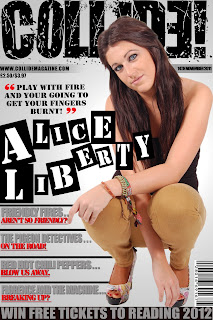
This week I began to make my front cover on Photoshop. I started by colour ranging my image, and using the quick mask tool to effectively cut out my image, so it looks professional. I placed it to the right of my page, as I have put my sell lines on the bottom left of the page. I followed my colour scheme of red, grey, black and white. I used to spotlight tool to create a gradient grey-white background, so that it did not look too plain. My masthead dominates the page, but not quite as much as the main image as that overlaps it. But I used a splatter-like font to create a bold, graffiti style masthead. I chose to do this in the colour black as I feel it connotates success and sophistication.
For my main sell line “ALICE LIBERTY” I created 12 different sized black boxes, I then places large, bold, white letters on top of them. This gives the illusion of newspaper styled writing, as it looks as if they have been cut out separately and scattered across the page. I did this as it makes my front cover stand out from other magazine articles that use the same style font for their main sell line as their other sell lines.
Above my main sell line, I have placed a pull quote from my article in black: “If you play with fire, your going to get your fingers burnt.” I did this as I felt it would give my readers a taster on what my feature artist’s characteristics are like. I know a quote like this will appeal to my target audience, as they will have an interest in reading about rebellious music artists.

Contents Page Photoshop Draft

I generally stuck to the design I made for my magazine contents page. I wanted a lot of text to make my magazine seem worthy of its price. I added the Facebook feature, to imply i am thinking about modern forms of technology in a way to distribute my magazine.

Tuesday 6 December 2011

CLASH word assosiation

CLASH’ Word Association

Double Page Spreads draft


Here is the first draft of my double page spreads, I didn't follow my original design, as the images spaced by text didn't conform to the general style of bold text i have decided to use for my magazine. 

Friday 25 November 2011

Front Cover Photoshop draft

This is my finished draft that i created on photoshop, i have followed the general design of my sketched draft.

Tuesday 15 November 2011

Timelaps of photo shoot


I created a timelaps that took photos of my photo shoot evey ten seconds. This is because it can be used as evidence that i took the photos i am using in my magazine.

Friday 11 November 2011

Model Releases


Here are the model releases for the models i took photos of on my photoshoot and aim to use in my music magazine. This verifies that i took the photos and that they give me their permission to have them star in my magazine. Here you can see they have wrote their name and signed it. This is important as a professional magazine would not use photo's of people without having their permission, therefore this makes my magazine seem more professional and well thought-out.

Wednesday 9 November 2011

Double Paged Spread Design Draft

 This is my double paged spread design draft. I have chosen to do something original and eye catching. Between each letter of the name i have placed an image, as i want to use as many photo's as possible, to maintain my 'busy' looking magazine, making it look worthy of cost. I have got two similar images, but wear my model is wearing different coloured trousers, therefore i have placed them next to each other, making it look like a mirrored image, i feel this will make my double paged spread stand out against other articles.

Contents Page Design Draft

This is the design i have chosen to go with for my contents page. I have kept the title of my magazine at the top of the page to create a house style. I have included lots of images and put the page number underneath or on top of it, allowing the reader to visually choose what they would like to read. I have included four main sections and a 'plus' section. I have included a band index also, to make my reader feel they are getting value for their money. There is also a subscription option on the page also, giving the reader the audience to subscribe to my magazine and it also makes my magazine look professional and successful. I aimed to make this page as busy as possible, as it is where the content of my magazine is.


This is the magazine i used as a general guide line when designing my contents page, as i feel it looks busy but still organised. It makes the magazine look worth its money and full of information, without making it look cluttered. It also follows the colour scheme i am going to use for my magazine.

Front Cover Design Draft

This is my front cover design draft. I have chosen to make my cover image very large and dominating, in order draw the target audience's eyes to my magazine. I have also made my main sell line in a large, bold, blocked letters font, making it clear that this is describing the cover image. I got this idea by looking at the front cover of an NME magazine that uses Lily Allen as a cover model, the large blocked letters are attractive and appeal to the target audience as they signify rebellion and an out of the ordinary magazine.
I have put sell lines all around my image, filling the page, making my magazine look worth the money. I have shown what type of stories will be presented on my front cover, using bands that i feel are appropriate to my genre of magazine. I have used bribery to appeal to my target audience also, as music festivals are something that would be of huge interest to my typical reader. I have kept it in black and white, but i am going to use the colour scheme of black, red, white and grey.


This is the magazine cover i used as inspiration, i tried to make my layout as similar as possible to this magazines, as this is my ideal magazine. It appeals to generally the same target audience as me, and i feel the layout and colour scheme make a professional and eye-catching magazine.

Diary Entry #8

Diary Entry #8

I have just successfully completed my ‘sell line ideas’ section and my ‘contents page ideas’ section of my planning process.
For my ‘sell line ideas’ I began by thinking about what I would expect to see on a rock genre magazine if I was a reader. I thought about stories on popular rock/indie bands and came up with sell lines such as: “The Kooks NEW album!” I thought about how I might use capitals and exclamation marks persistently in order to make my magazine seem exciting and to stand out from other music magazines. I also thought about stories that might make the reader feel my magazine will work for the uses and gratifications theory of escapism: “25 of the most annoying songs!” Giving my target audience something to laugh at and use for entertainment purposes. I also thought about bribes, to draw my reader into to my magazine such as: “WIN FREE TICKETS TO READING 2012”. The readers of my magazine will know that ‘Reading’ is a festival known to play rock/indie music; therefore this will appeal to them.
I also created a page explaining what will be included on my contents page. I have stated the sections that will be on my contents page: Reviews, News, Exclusives, Features and Band Index. All of which I noticed where on other music magazines such as ‘NME’ and ‘Kerrang’. I then stated what would be underneath each heading. I also named all the bands that would be in my ‘Band Index’ and made sure they kept in theme with my indie/rock genre.
I feel organised for each page now, and feel as though I will be able to make a successful front cover, contents and double paged spread. 

Diary Entry #7

Diary Entry #7


This week I have decided what I want to call my magazine. I chose to call my magazine ‘Collide’ as it was one of the recurring connotations of the word ‘Clash’, which I wanted to call my magazine, but felt it wasn’t original enough. I feel happy with the name ‘Collide’ as it implies there is a variety of music mixed together and put in my magazine, it also creates imagery of smashing and banging, which reflects my rock genre I am choosing to use as a theme for my magazine.
As well as this, I have finished writing my magazine article draft. I began with introducing that my article was about Alice Liberty’s new rise to fame. I included 13 questions, questioning the ‘star’ on her personal life, love life, adaption to being famous, lyrics in her songs, general appearance and her rebellious outlook on life. I chose to write it in a gossip like tone, therefore my target audience will feel that what they are reading is exclusive and that they are the first to read about it, making them feel special.
I feel happy with the answers I have given from Alice Liberty’s point of view; I created a character that seems rebellious, independent, opinionated and feisty, everything I feel the readers of Collide would want in a feature artist. I also feel it reflects the way artists are presented in the magazine ‘NME’, which is the magazine I am using as a guide line.

My Schedule

Media - Schedule

Sell line ideas/ Contents page ideas

Sell Line Ideas and Contents Page

Tuesday 8 November 2011

Contact Sheet

Contact Sheet

Here is a contact sheet containing every photo that I took on my photo shoot. My main model was a female, with dark hair and blue eyes, as i feel she fits the genre of rock and will compliment my magazine. I had four outfit changes during my photo shoot. One: red trousers, two: mustard yellow trousers, three: dress, four: leather jacket and dress.
I used my inspiration photographs of Lady Gaga and Rihanna, therefore i effectively found my front cover image by using ideas from a photo of Lady Gaga and also managed to take successful close ups by using the photos of Rihanna that gathered as inspiration.
I also took a few photos of other people, this was because it means that I will have more photos on my contents page that will all have been taken by me.
Article Draft
Everybody loves a rebel. Everybody loves talent. Everybody loves Alice Liberty. The new face of rock, this star has stormed in from nowhere, shocking the world with her music. Offensive lyrics, jaw-dropping videos and a bass that shakes the ground you stand on – this girl is exactly the type of artist we LOVE. And who’d of known Collide would have been lucky enough to grab an interview with her, and get up close and personal with this year’s hottest talent!
So Alice, you’ve gone from posting your videos on YouTube, to being chased down the street by screaming fans! How does it feel to be such a star all of a sudden?
(Laughs) Well, I will admit sometimes it is a bit scary to have people chanting my name as I leave my house to buy a pint of milk, or to have people grabbing at me. I sometimes feel like it’s all a dream, I mean, I’m just an ordinary girl! It’s such a change in lifestyle; I’m still adjusting to it all to be honest!
Well, you most certainly are NOT just an ordinary girl any more Alice. You come across as a bit of a rebel, so tell us, what’s the most rebellious thing you’ve ever done?
(Smiles) Well, I tend to try to behave myself these days, anything I do is snapped by the pap, and I wouldn’t want to set a bad example to any of my younger fans, but back in the day... I suppose the most rebellious thing I have ever done is broken into a theme park. Not naming names, but one of my close friends’ dad used to be a manager of quite a well known theme park, stealing the keys, one night me and a bunch of my friends broke in and rode the rides all night, we got pretty wasted, ended up falling asleep in the teacups and being caught the next day. Was such a laugh!
Wow, that does sound rebellious, you are certainly proving to be as bad as you seem! Being the way you are, you get a lot of negative criticism, how do you cope?
To be honest, I take no notice. I get as much criticism as any other rock music artist out there. Of course, at times I breakdown, having rumours go around about you are always bad, but to have rumours go around the WORLD about you is just terrible. But I get through. I feel any publicity is good publicity right? And at the end of the day, anybody who knows me knows I worked my arse off to get where I am today. I was brought up on a council estate, bullied for four years for my appearance but came out of it with straight A’s. I want to show young people that are less fortunate in life that you shouldn’t let life get you down, you can achieve, just don’t give up! So, if the papers are saying shit about me, then it means nothing. I’ve had it my whole life, it only makes me stronger!
Well Collide admires your optimism and strength! How do people back in Wales deal with your fame, after all you were brought up there, do you get much jealousy?
No, not really. I lived in London up to age 5, then moved to Wales, my parents still live there, so it is my hometown, I lived there for 15 years, and everyone is so supportive! Whenever I go back, my town celebrates and congratulate me on my achievements. I’m still such a home girl when I’m down there, pub lunches and walks in the village. It’s not like I stroll down there in a limo, keeping my shades on, looking down on people. I roll into town in my cute lime green Volkswagen beetle, I treat everyone just as I have my whole life, just because I’m a bit more known now, I wouldn’t change the way I am. So there isn’t much for people to envy, everyone’s just proud I suppose.
‘A bit more known’? Alice, you’re a worldwide known music artist! Right, let’s get down to music! What’s your inspiration?
Generally, my past or present experiences. I get my lyrics from feelings and emotions. I always carry a notepad around with me, so when I’m really pissed off, you see me frantically scribbling words down. Which I then take home and turn into lyrics. It’s an interesting approach, but it’s a tip I was given by Hayley Williams from Paramore. I met her at an award show early this year, and she gave me some tips on how to write good lyrics, so I really owe her, lovely woman and she’s had a huge impact on my music career. In general though, I base my songs mainly on my failed love life! (Laughs) Or anything traumatic, as it fits best with my music type.
Failed love life? Judging by pictures, you seem to have a very gorgeous guy with you at most times, care to share anything on you and Mitch Wendles relationship?
(Smiles) Mitch and I are just friends! The pap can snap as many photos of me and Mitch as they like, we’re just friends, have been for a very long time. I’m not looking for a relationship at the moment, I want to focus all my energy on my music career, once I feel satisfied with the direction it’s going in, maybe then I’ll consider a bit of a romance with someone new. As for Mitch, he has a girlfriend, who I am also very close with! I’d hate for people to assume me and Mitch have something and for it to put any strain on his relationship with his girlfriend!
Ah, well at least that has been cleared up! So, your dress sense is of often envied by many of the female public, do you spend a lot of money on your appearance?
To be honest, not really! Obviously I have a hair stylist and make-up artists for gigs and concerts and any other large events, but on general nights out, I do everything myself. I chose my own costumes for most events also, obviously I have a costume designer, but she’s more of a costume ADVISER! I’m very stubborn and stroppy when it comes to my appearance, so I like to choose my own outfits! I’ve also never really been the type to buy designer clothes! I love high street brands like Topshop and River Island, I’m not really materialistic! However, I am a fool for a pair of Jimmy Choos!
As we can see, you are wearing a beautiful pair today! What about your friends, you obviously earn a lot of money now, do your friends take your cash on a night out or do they respect what’s earnt by you, belongs to you?
Oh definitely! They never expect money or try to skive money from me! On a night out, all my friends will bring their own money! But I am a very generous person; those who are close to me will often get treats. Now I have the money, I love buying gifts for people. If I’m out shopping, and see something a friend will like, I’ll buy it without thinking twice. I think if money isn’t shared, it cannot be enjoyed!
Wow, Collide wants to be one of your friends! It’s come to our attention that you take a lot of participation in charity work! Why do you choose to do this?
I feel very strongly that if every fortunate person shared their money with those who are less fortunate, then the world will be a better place. I’m not a crazy ‘WORLD PEACE’ type of girl, but I feel so much happier to know that the money I earn might be saving lives. I’m actually working on making my own charity for a children’s hospital back in Wales that is in desperate need of money and support. I’m thinking of creating a single about the people children I have met there, and giving any money that is made from it straight to the children’s hospital. It might not go with my typical rebellious and rock-type appearance, but I really just want to help! And now I’m doing pretty well, I feel I can! I’m also working on a song for Children In Need nearer Christmas, but you’ll have to wait to see that!
That does sound exciting! You seem like a lovely person Alice, Collide admires your generosity! So, tell us, is there any artists you are hoping to work with?
Well, to bring her up again, I think me and Hayley Williams might be working on a duet next year. But I’m not giving any more away! As for who I would like to work with, it has been my lifelong dream to perform with Debbie Harry! I absolutely adore her, she is such an inspiration! I’d love to meet her, and maybe make a track. I mean, it’s Blondie! Who wouldn’t want to work with Blondie?!
Well, let’s hope she sees this! Your song ‘Shut Up and Die’ has a lot of anger in it! I mean, you can see from the title, it talks about you being broken hearted. Have you had a lot of bad relationships in the past?
(Laughs) Yeah, I thought that title was appropriate at the time, hearing it now, it doesn’t exactly make me sound like a nice person, but trust me, it had reasoning! As for being broken hearted, I mean who hasn’t been? I’ve had my fair share of bad relationships, I have been treated very badly by boyfriends in the past, no wonder I’m such a mess eh! But I guess my music is how I get through it. Most girls will cry and eat ice-cream, I make angry and insulting songs! I have had bad relationships and good ones, but at the end of the day, what relationship ends WELL? Nothing lasts forever I suppose.
How do your ex’s react when they hear these songs, ‘Shut Up and Die’ was obviously directed at an ex, how did he take it?
Badly... is an understatement (Laughs)! I mean, no guy likes having an ex-girlfriend bad mouth them to anyone, but to have an ex-girlfriend bad mouth you to the whole world, and actually get paid for it? Well, that’s just a whole lot worse. I suppose it’s my revenge! Break my heart and I’ll publically humiliate you to the whole world. If anything, I’m doing him a favour, he will never hurt a girl again, next time he’ll be more careful! Play with fire and you’ll get your fingers burnt – that’s what I say!
Woah! BOYS WATCH OUT! Alice Liberty is out for revenge! Well, Collide thinks if he hurt you, then he deserves it!  Recent gossip tells us that you’re thinking of doing a bit of an... Explicit music video?
(Laughs) NO WAY! I have had many offers for nude photo shoots, explicit music videos, but that’s not my thing! I don’t want to give the impression that I’m that sort of girl. Also, I have many young fans. If I was to make a video with me doing inappropriate things, in inappropriate positions, in inappropriate clothes... that would make me a bad influence. I will definitely not be doing an explicit music video.
Well that’s good to hear. Thank you so much for your time Alice, we know your busy, but the readers of Collide will be THRILLED to hear from you!
It’s been a pleasure!

Wednesday 19 October 2011

Diary Entry #6

Diary Entry #6 – 24th October 2011
This week I have been very busy on my blog. At the beginning of the week I created my colour connotations page and my name ideas. However, now I have officially completed my audience profile and put up my poll results.
I created a poll asking questions that I wanted to know the answer to in order to make my magazine more successful and accurately made for my target audience. I asked questions such as ‘what do you look for in an article?’ and gave possible answers such as ‘mostly text’. This has helped me a lot actually, as it has provided me with knowledge on subjects such as price, layout, content, design and so on. I now feel very confident that my magazine will be successful and I have no doubts about what I will include on my front cover, contents page and double paged spread.
As for my audience profile, I spent a long time thinking about what my ideal reader would be like, and created a profile explaining her hobbies, favourite books, music, where she would live, where she would go in her spare time and so on. This has shown that I am basing my magazine around a person of that sort. Underneath my profile I wrote about my general target audience, discussing what social category they will be from, demographics, psychographics, age group, male or female and have given reasoning for each of my decisions. 

Poll Results

Poll Results:

How much are you willing to spend on a music magazine?
£1 or under – 20%
£1.50 - £2.50 – 60%
£3 .00 - £5.00 – 20%
Therefore I am going to make my magazine around £2.00.

What colours appeal to you most on a magazine?
Yellows/Reds – 20%
Pinks/Purples – 20%
Blacks/Whites – 40%
Greens/Blues – 20%
This has shown me that primary colours and bright, loud colours do not get as much attention as plain colours like black and white. This could be because black and white creates a more sophisticated look and other colours possibly come across as tacky. Therefore, I know to include black and white as my main colour scheme.

What types of bands/artists interest you?
Rock/Punk – 0%
Indie – 20%
R&B – 80%
Pop – 0%
This has shown me that people of the age group 14-17 enjoy reading R&B magazines, rather than my chosen genre of rock/indie/punk. This has informed me that I must make sure my target audience is of an older age group and will appeal to those in their 20’s and 30’s.

What look to do you prefer to see on magazine front covers?
Minimalist/simple – 20%
Busy and informative – 80%
This has given me the knowledge of how much to include on my front cover and to ensure it has a lot of sell lines and writing in order to make the magazine look busy and informative at first glance.

Do reviews change your opinion on particular bands/artists?
Yes – 20%
No – 60%
Depends on where the review has come from – 20%
This has shown me that constant criticism in my magazine is not needed, as the majority of people do not take any notice of it.

Why would you read a music magazine?
To find out about gigs – 20%
Information on new upcoming bands/artists – 40%
To find out about the history of music – 20%
To read reviews – 20%
This has told me that I should inform my readers that my main feature artist/ cover model is a new artist.

What do you look for in an article?
Mostly images – 0%
Mostly text – 40%
A balanced amount of text and images – 60%
This has informed me that rather than having more text, or more images, I should aim to make my main article balanced for both features.

If you find a music magazine you like, do you visit the website?
Yes – 40%
No – 60%
This has told me that new technology (the internet) has not been over populated and magazines are still people’s main source of musical information, that it is the preferred method.

How often do you buy music magazines?
Weekly – 0%
Monthly – 0%
Yearly – 40%
Whenever I can – 60%
I now know that my target audience might not read my magazine every month, due to money issues or other reasons, therefore I should make sure every issue is completely different and that I do not refer to ‘last month’s issue’ often, as most readers might not have purchased it.

Do you read the editors note?
Yes – 20%
No – 80%
This has told me that I do not need to include an editor’s note to have a successful magazine, as the majority of people do not take notice of it. 

Diary Entry #5

Diary Entry #5 – 24th October 2011


This week I have successfully created my name ideas and my colour connotations page for the plan for my magazine. For my name ideas, I spent a lot of time researching band names such as ‘the clash’ and so on, in order to get some insight as to what rock bands names are like, so I can make my magazine an obvious ‘rock magazine’. I also looked at the connotations of ‘rock music’, in order to view the actual definition of rock, therefore making it easier for me to think of a name that my target audience will have a personal identification with. I came up with the names:
- CLASH
- Backstage Beats
- WBR (World’s best rock)
- Rock, paper, singers.
I feel I have come up with successful names that have made it easier for me to decide what I would like my final magazine name to be.
As for my colour connotations page, I spent some time reviewing my similar product research, reminding myself of what my inspiring magazines, such as NME and Kerrang used when it came to colour schemes, and came up with the four colours of:
- Red
- Black
- White
- Grey
I am happy with these colours as I know the connotations of them will make my music magazine seem dangerous, trustworthy, sophisticated and professional, therefore selling them to my target audience who will be looking for these features in a magazine.

Name Ideas For My Magazine

My Colour Scheme

Media Music Magazine My Colour Scheme

My Target Audience

Media Music Magazine My Target Audience

Tuesday 18 October 2011

Mood Board and Inspiration

Mood Board

Monday 17 October 2011

Diary Entry #4

Diary Entry #4 – 17th October 2011
This week I am going to do my photo shoot for my magazine. I have been thinking about the range of images I want to take, ranging from an extreme close up of an eye, to a long shot. I am going to have my model wearing the same pair of trousers, but one pair is burgundy and the other pair is mustard. With this mise en scene I am going to try and create an effective mirror image, where my model will be striking the same pose but wearing a different outfit. I have thought carefully about creating abstract and visually striking images for my double paged spread and front cover.
As well as preparing for my photo shoot, I have also explored Cam Studio. This is a new programme to me, however this week I have successfully created a video showing the steps I took to create my preliminary front cover and contents page. I clicked on each layer, step by step, revealing what I did next. I now feel confident on this programme and feel I can use it to present work again.

Diary Entry #3

Diary Entry #3 – 10th October 2011

This week I decided to focus on my Proposal. In my proposal I explained my idea for my music magazine, what I want to involve, who will be featured in my magazine, the target audience and the genre of music I am focusing on.
I explained possible ideas I have thought of for my main images, using artistic ideas such as confetti and paint. I also described why I am choosing to create an indie/rock magazine because of my wide knowledge on magazines such as NME and Kerrang.
I explained the age group of my target audience and why I feel they are people who will be interested in my magazine.
I feel doing my proposal has helped me as I now fully understand what I need to create and has a general idea of what colours, images and layouts I need to create to make my magazine typical to the rock/indie magazine conventions.

Friday 14 October 2011

My Music Magazine Proposal

Thursday 6 October 2011

Diary Entry #2

Diary Entry #2 – 6th October 2011

This week in Media Studies I have been working on a key concepts presentation based on the magazine NME. I have chose to create this key concepts presentation on NME, as it is a magazine that follows the genre of punk rock, indie, mainstream and individual bands. I aim to base my magazine on the same genre as NME does as I feel it is a genre I know most about, therefore will find it easier to create a house style and take appropriate images for my magazine, of people in outfits and positions that portray the genre of indie/rock.
I created this presentation on Prezi, as I have experience from GCSE and know how to create an interesting looking presentation. I feel this will imply that I have skills on other forms of media presentation programmes, other than the obvious Photoshop, Blogger and PowerPoint.
On my presentation I have included information about brand identity, the way articles and music artists are portrayed, the history of NME, codes and conventions, institution and representation. I did this as I want to show that I have knowledge on magazines therefore implying I am confident I will be able to create a successful music magazine.

Monday 3 October 2011

Similar Product Research

MEDIA Similar Product Research

Tuesday 27 September 2011

Diary Entry #1

Diary Entry #1 – 27th September 2011
In my first week of AS Media I began my preliminary task which involved me sketching out a Haydon School magazine and then designing it using my skills on Photoshop which I learnt through doing media at GCSE level. I did not find this task particularly difficult, as in GCSE I created a movie magazine, therefore I knew what essential features I had to involve, for example, masthead, sell lines, date, footers, main image, anchors and so on. I have also begun to do similar product on contents pages, front covers and double page spreads from other music magazine. I did this as I know it will give me a greater understanding on what I should include on my own music magazine when it comes to creating it. I looked at features such as the colour scheme, font sizes, images, headings and titles, layout of articles and use of language.
I think for my music magazine I am going to use NME as a guide line. This is because after studying particular magazines I think it includes features that will show my skills. Magazines like ‘Vibe’ seem to be less busy and have a much more plain design, therefore I feel if I was to use this as a prime example it might not show what I wish to show. I also like their colour schemes. If I was to go for a music magazine with a sub genre of rock, I would probably use colours such as red, black and yellow. However, if I go for a music magazine with a subculture of pop or R&B I would probably use light colours such as blue, green and pink – judging from what I have found in my research, these are the most common colours for that genre of magazine.
I already feel I will be able to produce an appropriate magazine for whatever genre of music I choose to go with. I still need to organise a title and plan what type of images will be included in my article, front cover and contents page though.

Tuesday 13 September 2011

Preliminary Task


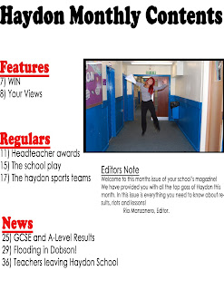
For my preliminary task I created a front cover and a contents page for a school magazine named ‘Haydon Monthly’. Firstly, I sketched the magazine on plain white A4 paper using my knowledge of magazines to create an appropriate design. Once I was happy with my designs I went onto Adobe Photoshop and began to create my front cover.
I used the Horizontal Type Tool to type my magazine title at the top of the page, using the font ‘Cooper Std’ because it is large, clear and bold therefore will grasp the target audience’s attention. I named it Haydon Monthly to imply that it is information about the school released on a monthly basis. I then began to create my sell lines using the same tool, however this time I changed the colour and the font of the writing to create an interesting and different style.
I tried to make my magazine front cover look appealing to the younger audience, therefore placed some sell lines diagonally in order to create a variety of different styled sell lines. I did this by clicking ‘Ctrl T’ which allowed me to move the text in different directions. I then created a long black rectangle using the Rectangle Tool and placed it at the bottom of my page. I the wrote in white ‘Bell Gothic Std’  font ‘win a non-school uniform day for your form’, as I feel this is appropriate content for the genre of this magazine.
I then went to File and clicked on Place to select my image I wanted as my front image. It is a photo of a boy holding his results with a happy face. I chose to use this photo as I feel it relates to my main sell line ‘Proud Students Pass’ and gives the school magazine a positive tone.
I then went on to create my contents page. For this I chose to use a simple theme. I used the Horizontal Type Tool to write ‘Haydon Monthly Contents’ in the same font as my front cover title. I did this to create a house style and make it look more professional. I then went on to create three different sections: ‘Features’, ‘Regulars’, and ‘News’. I created these in a larger font than the actual information underneath to make it obvious they are headings of different sections of the magazine. I made them in red also. I did this as it is an eye-catching colour and will draw the reader’s attention to each article in the magazine. It also stands out against the white background.
I then clicked on File and Place to insert a photo of a student jumping in the air holding their results, in order to keep up the positive tone of the magazine. I then clicked on the Rectangle Tool and drew it a little bit larger than my photo, and placed it behind it in order to create a Polaroid type photo.
I then also created an editors note to make my magazine look professional.