Diary Entry #1 – 27th September 2011
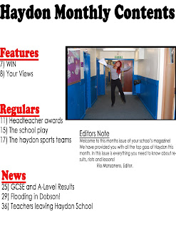
In my first week of AS Media I began my preliminary task which involved me sketching out a Haydon School magazine and then designing it using my skills on Photoshop which I learnt through doing media at GCSE level. I did not find this task particularly difficult, as in GCSE I created a movie magazine, therefore I knew what essential features I had to involve, for example, masthead, sell lines, date, footers, main image, anchors and so on. I have also begun to do similar product on contents pages, front covers and double page spreads from other music magazine. I did this as I know it will give me a greater understanding on what I should include on my own music magazine when it comes to creating it. I looked at features such as the colour scheme, font sizes, images, headings and titles, layout of articles and use of language.
I think for my music magazine I am going to use NME as a guide line. This is because after studying particular magazines I think it includes features that will show my skills. Magazines like ‘Vibe’ seem to be less busy and have a much more plain design, therefore I feel if I was to use this as a prime example it might not show what I wish to show. I also like their colour schemes. If I was to go for a music magazine with a sub genre of rock, I would probably use colours such as red, black and yellow. However, if I go for a music magazine with a subculture of pop or R&B I would probably use light colours such as blue, green and pink – judging from what I have found in my research, these are the most common colours for that genre of magazine.
I already feel I will be able to produce an appropriate magazine for whatever genre of music I choose to go with. I still need to organise a title and plan what type of images will be included in my article, front cover and contents page though.

