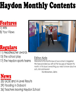
For my preliminary task I created a front cover and a contents page for a school magazine named ‘Haydon Monthly’. Firstly, I sketched the magazine on plain white A4 paper using my knowledge of magazines to create an appropriate design. Once I was happy with my designs I went onto Adobe Photoshop and began to create my front cover.
I used the Horizontal Type Tool to type my magazine title at the top of the page, using the font ‘Cooper Std’ because it is large, clear and bold therefore will grasp the target audience’s attention. I named it Haydon Monthly to imply that it is information about the school released on a monthly basis. I then began to create my sell lines using the same tool, however this time I changed the colour and the font of the writing to create an interesting and different style.
I tried to make my magazine front cover look appealing to the younger audience, therefore placed some sell lines diagonally in order to create a variety of different styled sell lines. I did this by clicking ‘Ctrl T’ which allowed me to move the text in different directions. I then created a long black rectangle using the Rectangle Tool and placed it at the bottom of my page. I the wrote in white ‘Bell Gothic Std’ font ‘win a non-school uniform day for your form’, as I feel this is appropriate content for the genre of this magazine.
I then went to File and clicked on Place to select my image I wanted as my front image. It is a photo of a boy holding his results with a happy face. I chose to use this photo as I feel it relates to my main sell line ‘Proud Students Pass’ and gives the school magazine a positive tone.
 I then went on to create my contents page. For this I chose to use a simple theme. I used the Horizontal Type Tool to write ‘Haydon Monthly Contents’ in the same font as my front cover title. I did this to create a house style and make it look more professional. I then went on to create three different sections: ‘Features’, ‘Regulars’, and ‘News’. I created these in a larger font than the actual information underneath to make it obvious they are headings of different sections of the magazine. I made them in red also. I did this as it is an eye-catching colour and will draw the reader’s attention to each article in the magazine. It also stands out against the white background.
 I then clicked on File and Place to insert a photo of a student jumping in the air holding their results, in order to keep up the positive tone of the magazine. I then clicked on the Rectangle Tool and drew it a little bit larger than my photo, and placed it behind it in order to create a Polaroid type photo.
I then also created an editors note to make my magazine look professional.
I then also created an editors note to make my magazine look professional.

No comments:
Post a Comment